I’m not one to be easily confused by UI decisions. Comfortable with the command-line, and having used dozens upon dozens of different distributions of Linux, and nearly every version of Windows since 3.11 for Workgroups (and MS-DOS before that, v. 6.22) — I can’t say I’ve ever seen anything like Windows 8.
Granted, that’s how Microsoft wants it to be perceived. Perhaps they’ve succeeded in that cursory endeavor.
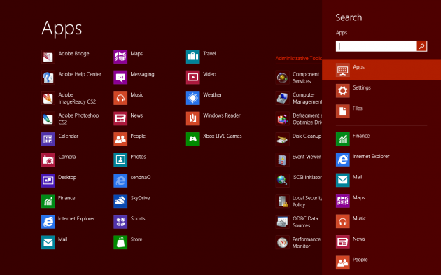
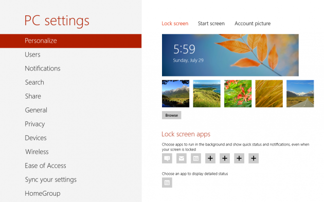
Some things are really nice, like the settings page and various media consumption “apps” in Metro. However, the movement between Metro and Explorer is truly jarring and is bound to baffle even the most tech-savvy of customers.
Most confusing of all, are the awkward shortcuts. For example, Windows Flip-3D (Windows Key + Tab) is no more, it is now essentially a vertical Alt + Tab on the left side of the screen — except that it only switches between Metro “Apps,” not windows open on the Desktop (Explorer). Confused? This is fine, except for that if you aren’t familiar with the Windows Key + Tab combination, you’ll have to access it by hovering your mouse over the left side of the screen to reveal the “Start button” then move your mouse upwards. I guess that’s intuitive? (I am unable to take a screenshot of this using the standard keyboard shortcut).
Did you get that last part? There’s no Start button on the taskbar anymore. It’s just not there. To “show” the “button,” you must move the business-end of the mouse all the way to the lower left of the screen to reveal it. ALL THE WAY. Not kinda almost there, but all the way to the lower left. It makes absolutely no sense at all.
“Getting back” is a recurring theme in Windows 8. Because of the strange Metro/Explorer combination, it’s rarely clear how to “get back” to where you last were. I might be working in Photoshop one minute, then want to change my Bluetooth settings — which throws me back into Metro. Once I am done changing my settings, it’s not entirely clear how to get back to Photoshop. If I hit the Start button on my keyboard, it just takes me to the main Metro Start screen. Tap it again, and it’ll snap me back to the settings page. The technically inclined will be able to figure it out due to their experience with Windows keyboard shortcuts, but for mortals — this is going to be a real tough sell. The “correct” way to get back is to tap the start key, then hit Desktop and it’ll take you back to a program like Photoshop running in Explorer, rather than a Metro “App” — hmm. Oh, by the way, Microsoft isn’t calling it “Metro” anymore — but since there’s nothing else to call it, I’m stickin’ with it.
Looking at a photo in Metro’s Photos “app” — how do I get that photo into Photoshop to make some changes? How can I even identify the path where that file is located? Double-clicking on a file in Explorer by default launches the Photos “app” — jarring you into Metro.
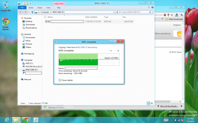
The Windows 8 copy (dialog?) box is pretty awesome. It doesn’t have the slick Vista/7 upper-animation any more, but it is certainly more practical and precise.
When browsing IE in Metro mode, it defaults to a real full-screen browsing experience, which is nice, but how do you bring up the address bar? You have to right click — and your right-click cannot be in a text-box, or it will bring up context-sensitive options for that. Moreover, opening a new tab is awkward because it is hidden due to the full-screen mode and if you want to see your open “tabs”? You guessed it — right click somewhere randomly. I am confident enough to state that a majority of computer-users have enough difficulty with the concept of right-clicking as it is. Windows 8 exacerbates this tremendously. Moreover, there’s no continuity between IE on the Metro side, and on the Explorer side. So, your tabs in Metro IE aren’t “synced” with the tabs on the Explorer side. I can imagine a lot of users being confused as to where their content is.
I am typing this review using Metro IE. Instinctively, I find myself reaching towards the upper right to minimize this window to do something else — but there is no upper-right. If I wish to bring up an Explorer window to locate a path of a file, I have to remind myself to hit Start, then Desktop, then locate the path, then return to Metro IE. Sounds simple, but it’s very, very unnatural and unintuitive experience.
When you move your mouse to the top of a Metro “app,” the cursor becomes a hand icon. Click and drag, and the active “app” becomes smaller and draggable against the Metro backdrop — for a while, I could find no conceivable purpose to this action. Later, I was shown a video that demonstrated someone dragging it downwards using a capacitive touchscreen to close the app. This seems like an intuitive gesture, provided you’re shown it at least once. Using a mouse, it makes little sense, and far from a natural gesture.
I will say this — Windows 8 is the fastest Windows I have experienced by far. You know, aside from Windows 98 on a Core i7 or something. Nearly everything feels dramatically improved and smooth. I am running this on an HP TX2500 convertible tablet PC, not the fastest machine by a long shot and performance is most impressive. Not only that, but everything works out of the box on a stock MSDN install. WiFi, HP hotkeys, fingerprint reader, webcam, list goes on — nearly all of it works flawlessly without the need for any awkward HP drivers.
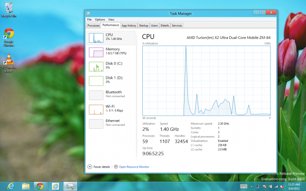
The task manager, by default, reminds me very much of the one in Windows 98. Once you click More Details, however, you see that it is packed with useful features and technical details. This is a tremendously welcome improvement. Obviating the need for MSCONFIG and third party tools to manage startup programs.
It is curious to note Microsoft embracing the buzzword “App” since Windows has been running Applications for well over two decades.
Speaking of Apps — this operating system should be fantastic on Microsoft’s upcoming Surface tablet. It appears as though Microsoft hired a decent creative director and ad agency this time around.
When your PC/tablet runs low on battery, it provides this nice overlay warning:
Windows 8 comes with a nifty PDF/XPS viewer called Windows Reader. It’s a functional if Spartan application. On the HP TX2500, using the right side of the touchpad indicates a scroll-downward to everything except Windows Reader, it seems, just where you’d most want it to work. Curious.
Windows Reader, like most other Metro Apps leave you with a how do I close this? feeling. There’s a few ways:
– Drag from the top of the Metro App down to the very bottom of the screen.
– Move mouse on the hidden start menu (lower left), then move upwards, then right click on the Metro App and select Close.
– Press the Start key on your keyboard/tablet. That’ll “suspend” the app, which is basically as good as closed.
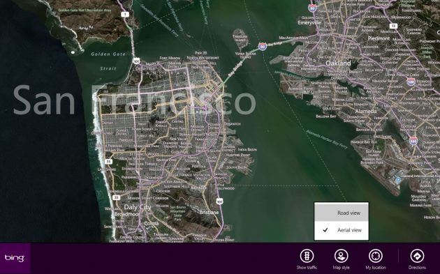
The Maps app is terrific, albeit lacking in features and depth for now:
Oh. And how the hell do you turn off the computer? Let’s see:
1. Bring up Metro via the Start “button”;
2. Click your username, which may or may not be linked to your Windows Live account username thingy in the upper right (if it’s still called that?);
3. Select Sign out. Wait.
4. Click the lock-screen, or drag it up with your mouse/touchscreen.
5. Then you can click the power button in the lower-right, and select Turn off.
Five steps. Hey, life could be worse.
This operating system should be awesome on Surface — and abysmal on the desktop. Admittedly, I am sad to see Aero Glass toned down so much in Windows 8. I’m also sad to see Microsoft pull so many blunders one after another.
The revisions to Office 2010 are not a welcome improvement to Office 2007 by any measure I can determine and this operating system, Windows 8, takes Windows 7 and makes it even worse. If I had any common sense, I’d short their stock.


I found 8 good and bad. But, i decided to go back to Vista (great OS after Service Packs and updates) since i got enough of problem that after 1-2 weeks of use, suddenly almost all Modern UI apps stopped working and Event Viewer said the problem was kernelbase.dll, so i reinstalled about a week ago and now, oh my god the kernelbase.dll problem was back, even after CLEAN install! Incredible. I just stick with Vista as it works.
SO glad to know others hate Windows 8 too! I bought a new Gateway Dual Core and it came with 8 and it sucks. The review was spot on Samuel. It was the very things I thought too. I mean who designed this mess? No Start button, weird awkward way to close or even see the time. I think a set of romper room kids could do better.
After Metro started hanging and freezing and then the os 8 freezing up, I had it. I formatted my drive and installed Vista instead. It works flawlwssly and I don’t regret it. I can actually play games now. 8 was always telling me it needed this or that or wasn’t compatible despite the options for it, (that don’t work), and then it would close or freeze or refuse to install. I think the boneheads at Microsoft did this on purpose so you would have to buy new games.
Now I can play my games, write and work on Vista and no freezing. So I too have gone back in time and am now using Vista. For those who are thinking of buying Windows 8, go check it out first. I seriously urge you to investigate it before you buy it. If you are the type who likes to only use your fingers to use a computer, then maybe it is for you, but if you are like most of us who use a mouse and actually need to work on it, stay far far away.
Spot on. That’s the problem exactly — I have work to do and Windows 8 makes it a major challenge to get basic work accomplished by showing me the `Ooo shiny.`
Has anybody else noticed the many similarities between Windows Vista and Windows 8?
– Both introduced a new interface: Windows Aero and… Modern UI.
– A revised Windows Explorer interface with new file transfer / file conflict windows.
– Bundled an anti-malware solution; Windows Defender and Microsoft Security Essentials.
– Include fully integrated Parental Control features.
– Introduced ‘Live’ features: Gadgets and Live Tiles respectively.
– Both include updated and/or new Mail, Calendar, and Contact features out of the box.
– There are also similarities with the new Windows Store and its precursor in Vista, Windows Marketplace.
– Finally, both offered updates to the standard Windows games, such as Minesweeper.