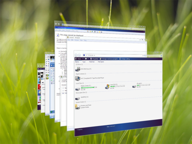
Something curious happened during Microsoft’s PDC in 2003 (See ‘geeks bearing gifts‘). They unveiled the then-exciting and anticipated Longhorn operating system that was powered in large part by the GPU. That is, each “window” of Windows would no longer be rendered in software. They would be rendered as full 3D planes using the GPU.
Why? Stability for one, also to offset the (GDI+) window draw that would otherwise consume CPU, to the GPU, for which it should be a relatively trivial task. Of course, the “Vista Capable” lawsuit proved otherwise, as a somewhat powerful GPU was required to enable Aero.
PDC 2003 even had a worthless but informative demo showing all of the various aspects of the “Longhorn” UI floating around and being manipulated in 3D with ease. No doubt using a powerful graphics card at the time.
It is this evolution that allowed Windows Vista and 7 to have the Rolodex-style “Flip 3D” effect achieved by holding down the Windows key and Tab simultaneously.

Aside from the stability and performance benefits, Microsoft’s decision to include a clever hardware-accelerated blur representing “frosted glass” looks beautiful.
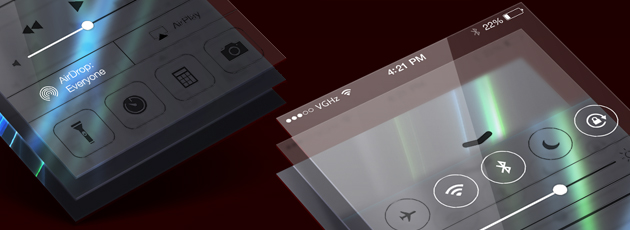
Strangely, this feature which existed in both Windows Vista and Windows 7, is gone entirely from Windows 8. Ironically, the frosted glass blur effect is being introduced in Apple’s iOS 7 as a feature which provides “context” to your content. (Advanced users can follow these steps to bring back aero mostly in Windows 8).
The decision to remove (frosted) aero glass in Windows 8 makes little sense, and provides no benefits to the end user. Moreover, using the keyboard shortcut WinKey + Tab no longer reveals the somewhat-useful Flip 3D, but instead triggers an awkward “Modern” flat looking task manager which only switches between apps, not windows.
I had the great misfortune of having to set up two Windows 8 machines recently. Both were set up with Modern Mix and StartIsBack. The end result is a workable version of Windows 8, but flat and devoid of character. It feels like a broken version of Windows.
We’ve reached a point where shuffling around the UI is the end result. Windows 8.1 introduces a few badly needed new features, such as the new All Apps screen, dynamic lockscreen, more tile sizes, desktop wallpaper behind the Modern start screen — but this a company with over 61 billion in assets (after liabilities, see archive of their balance sheet, September 28, 2013). These changes seem trivial, hardly the monumental changes we’ve seen in the past from companies with much fewer resources.
Customization has been at the heart of Windows since the very early days of Windows. Even Windows 95 had a feature permitting users to simulate the Win 3.x experience (program manager). Those days seem to be long gone, and relying on third party applications to keep Windows in working order seems to be the only way to be productive going forward. From Windows to Gmail, oversimplification leads to a dramatic reduction of productivity and craft.

Vista still holds up beating 8, at least feature-wise and with relatively higher performance on 06 hardware (esp. on the X64 architecture).
Tablet computing goonery should have been left out of the mainline desktop business.
Long live the Longhorn generation..